University Beyond Bars
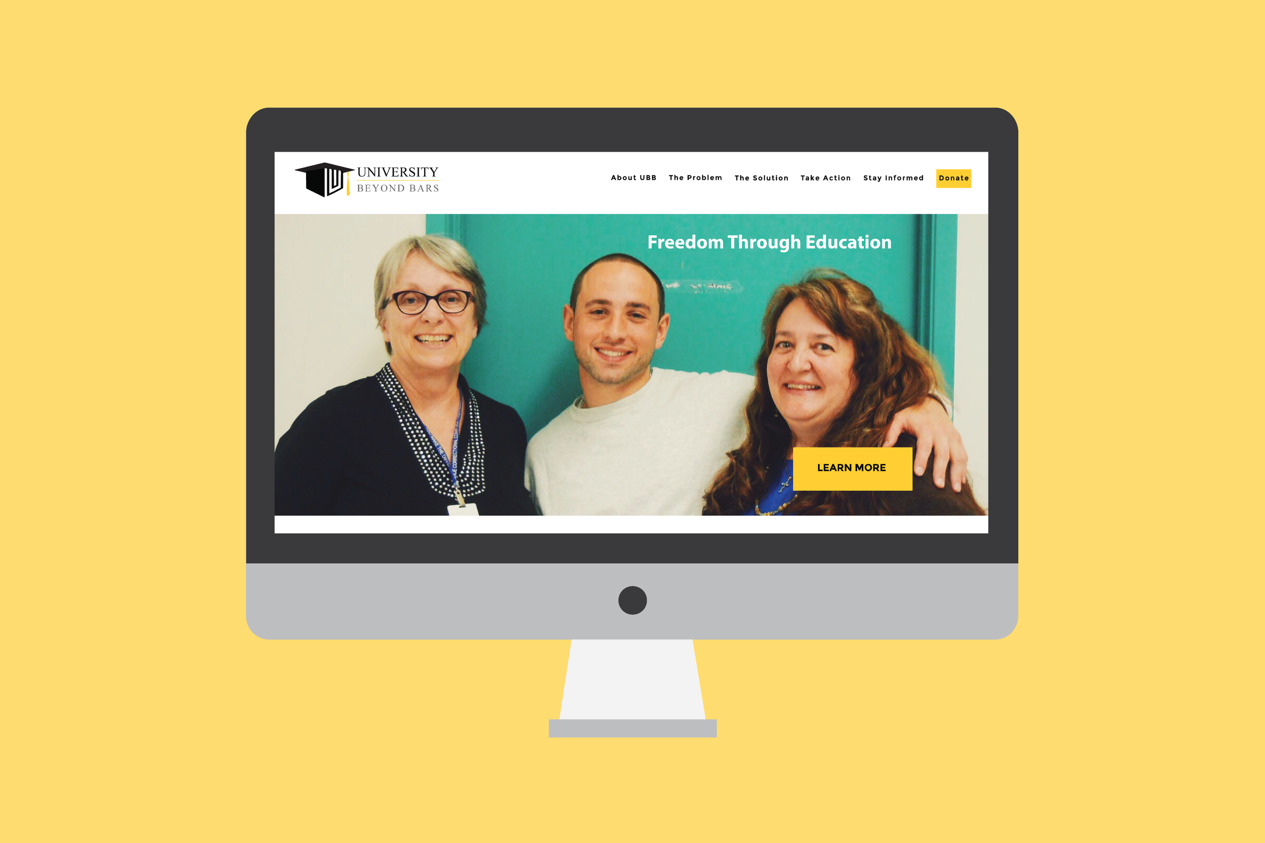
The Problem: University Beyond Bars is an established 501 c(3) non-profit organization in Washington State. University Beyond Bars uses donations to allow prisoners to obtain post-secondary education inside the prison. Not only does UBB provides education but it also creates a healthy community inside a very dark environment. Their website was in need of a redesign. UBB needed an easy way to complete and update the website as content changed. The target of the site is to attract private and corporate donors, since they heavily rely on donations to fund their programs.
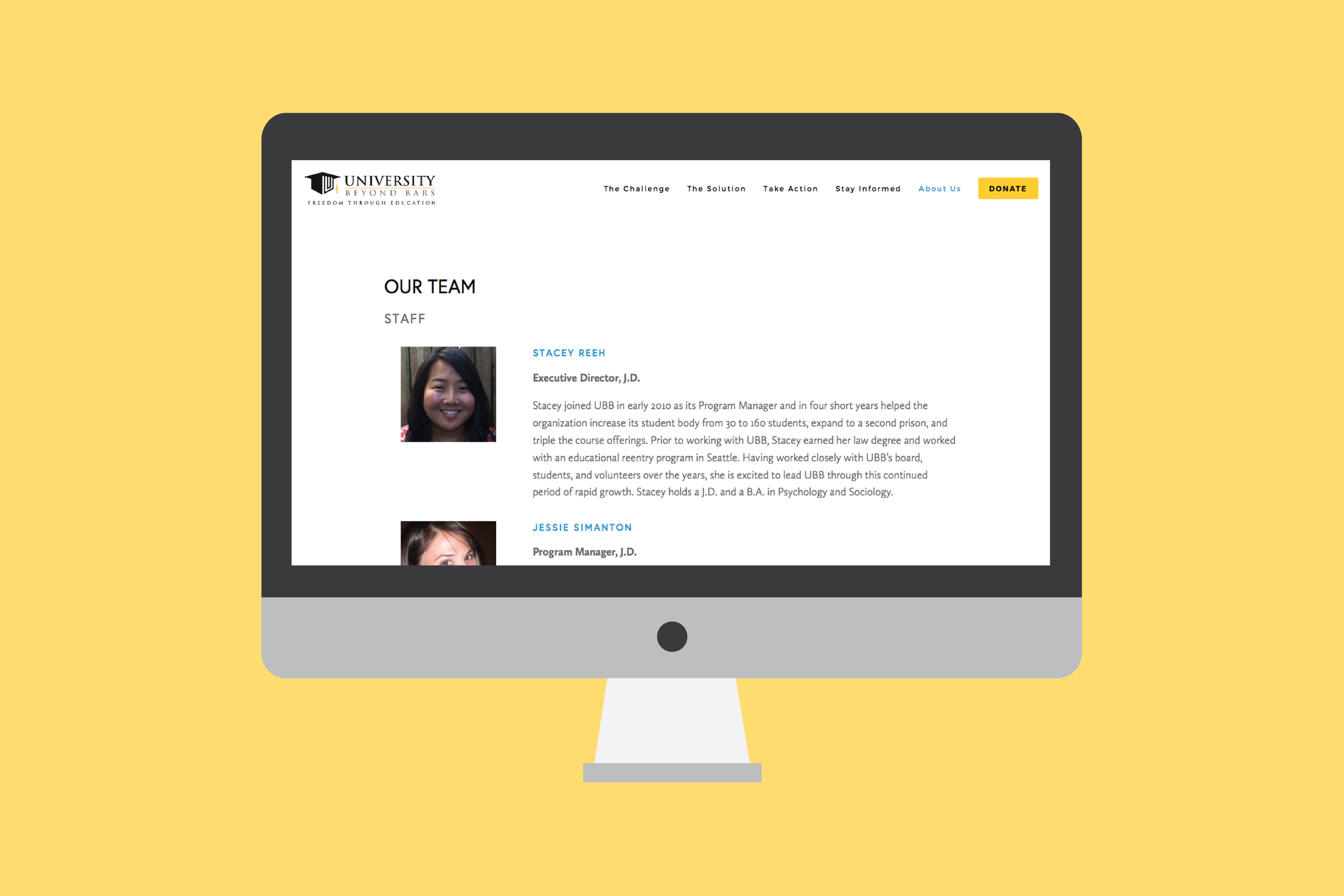
The Solution: My team used Squarespace as the platform for the site. After extensive research, heuristic evaluation, competitive analysis, user interviews, persona creation, a new sitemap, and identifying information architecture based on our research, our team delivered a fully redesigned website. You can check out the old site and see the differences. The new website will be live once it is ready to launch as the agency is still trying to update some content.
Client: University Beyond Bars
Team: Jill Wear / Kim Van Horn / Esmond Leung
My role: user research / wireframe / visual design lead/ high fidelity design screens

Prototype
Our team prototyped in Squarespace because the agency had so much faith in our final product that they would have to switch it over eventually. We asked ourselves, "Why not just do it in Squarespace?" However, because it is not just a suggestion or recommendation, our final design and product had to be perfect to our client's liking. Our team didn't see this as a challenge but an opportunity to take our design to the next level.
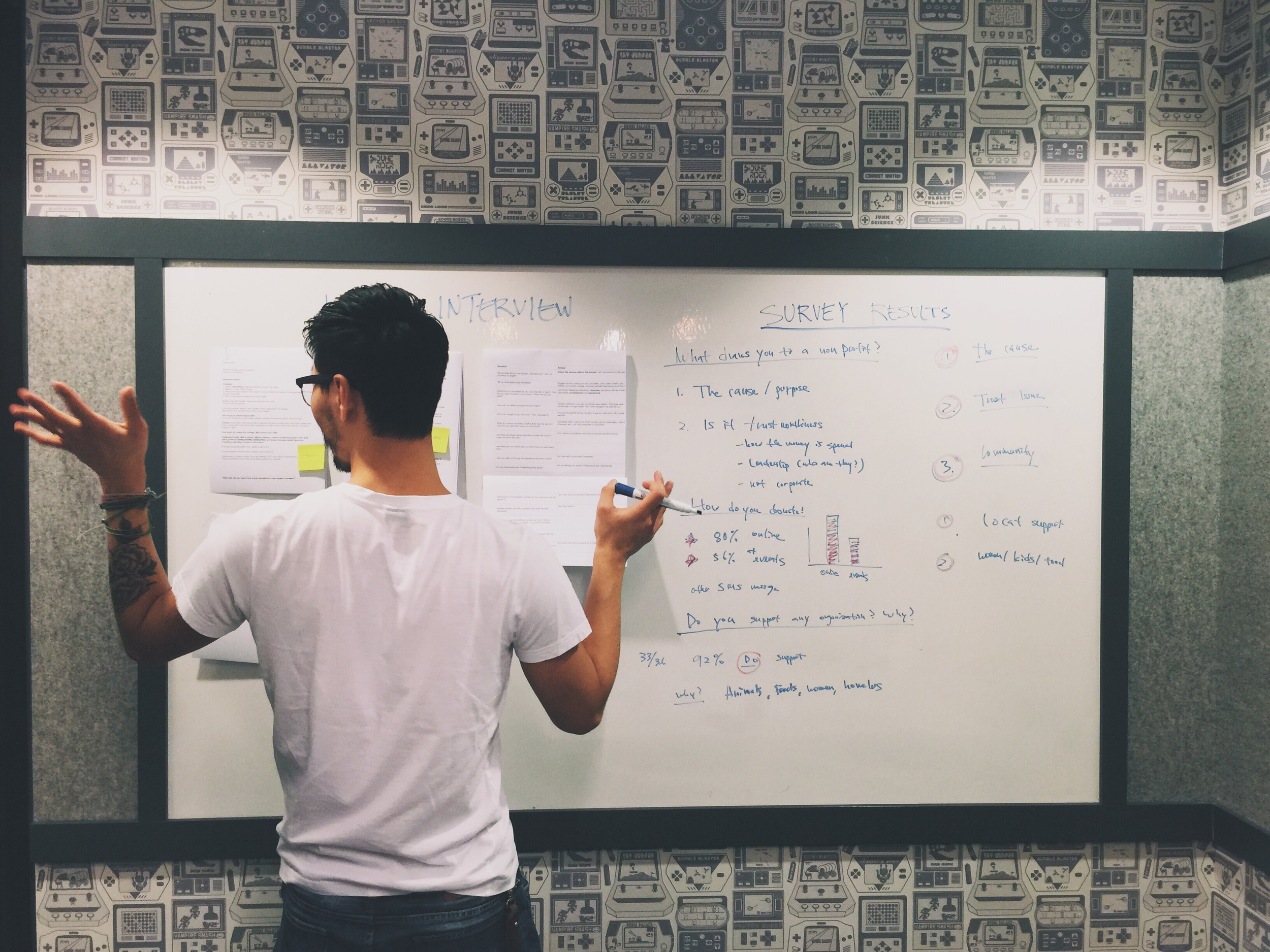
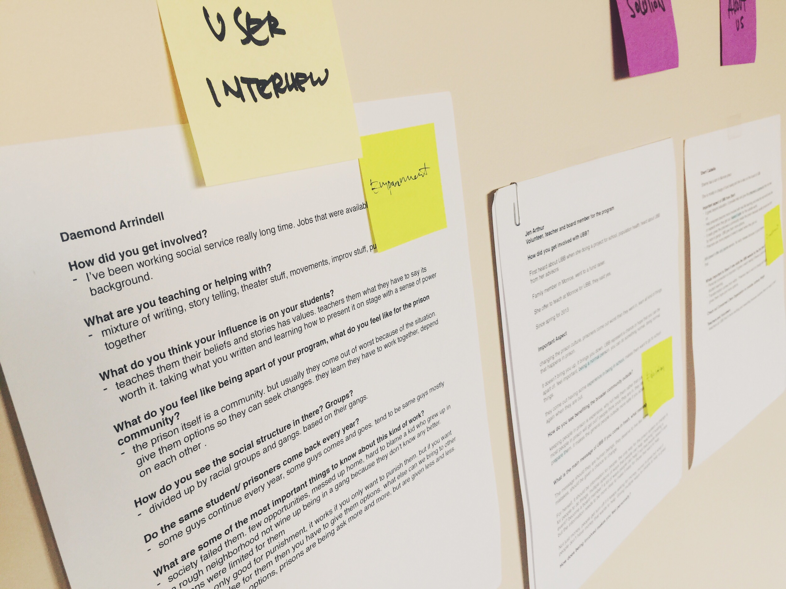
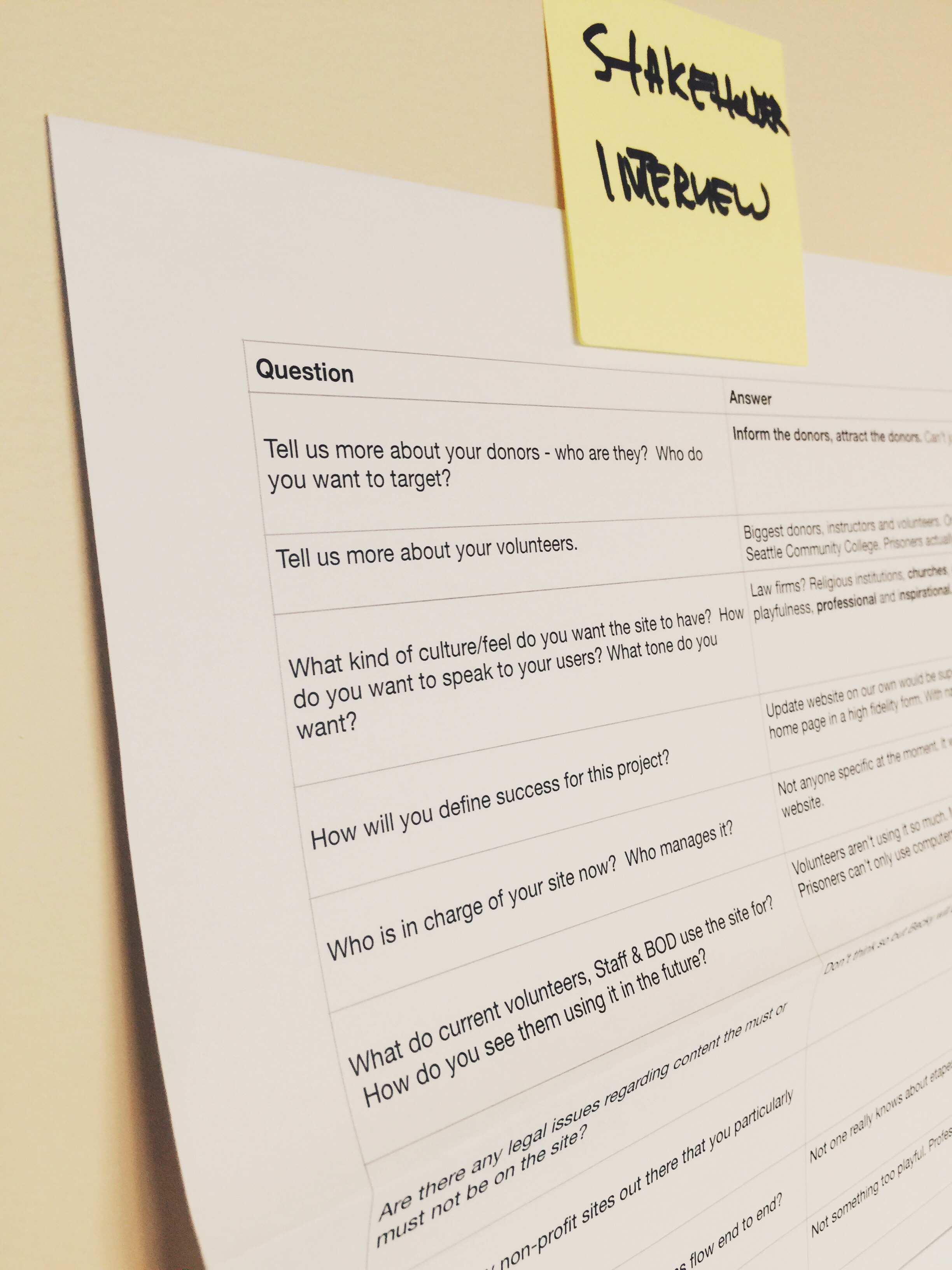
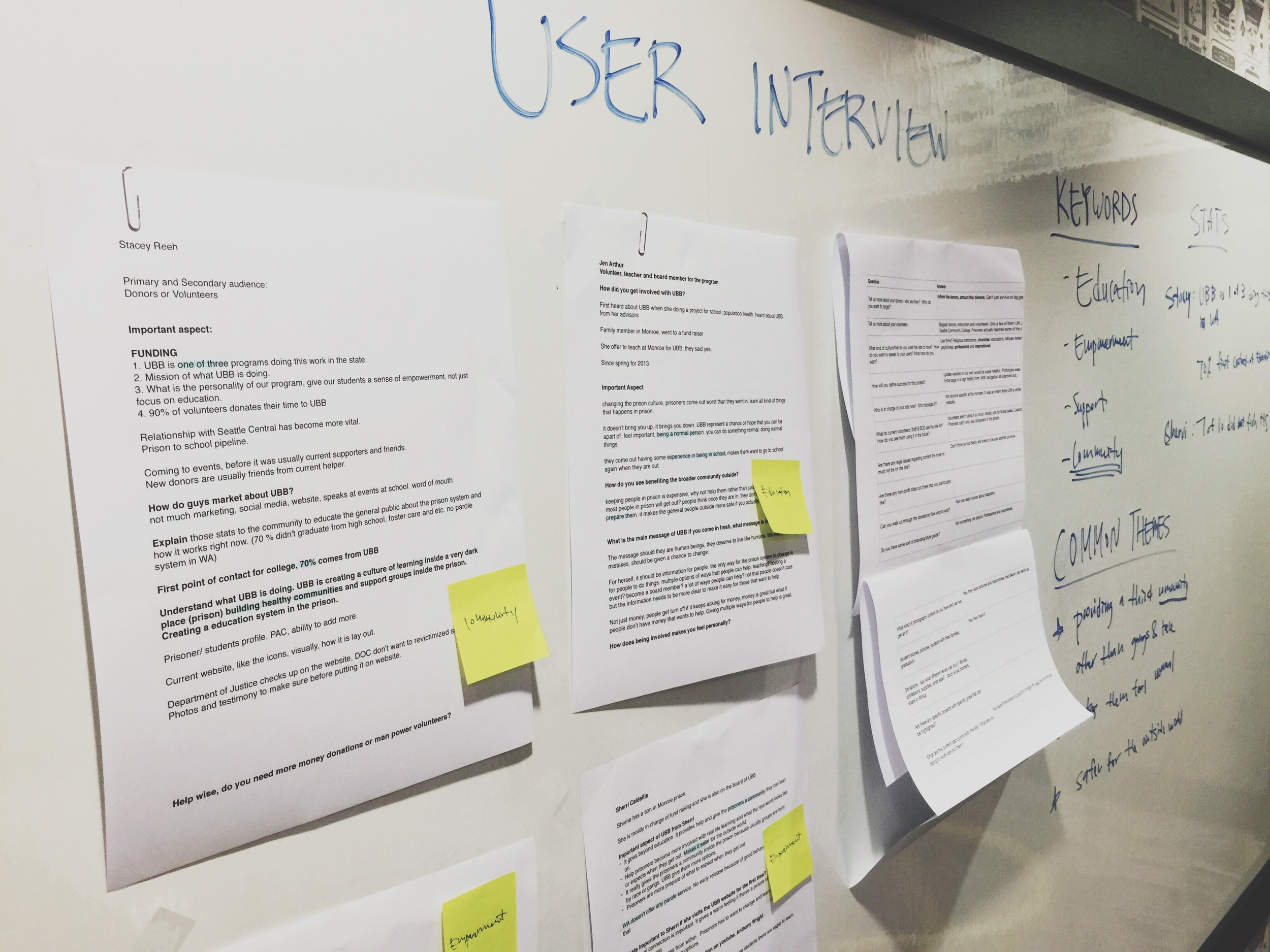
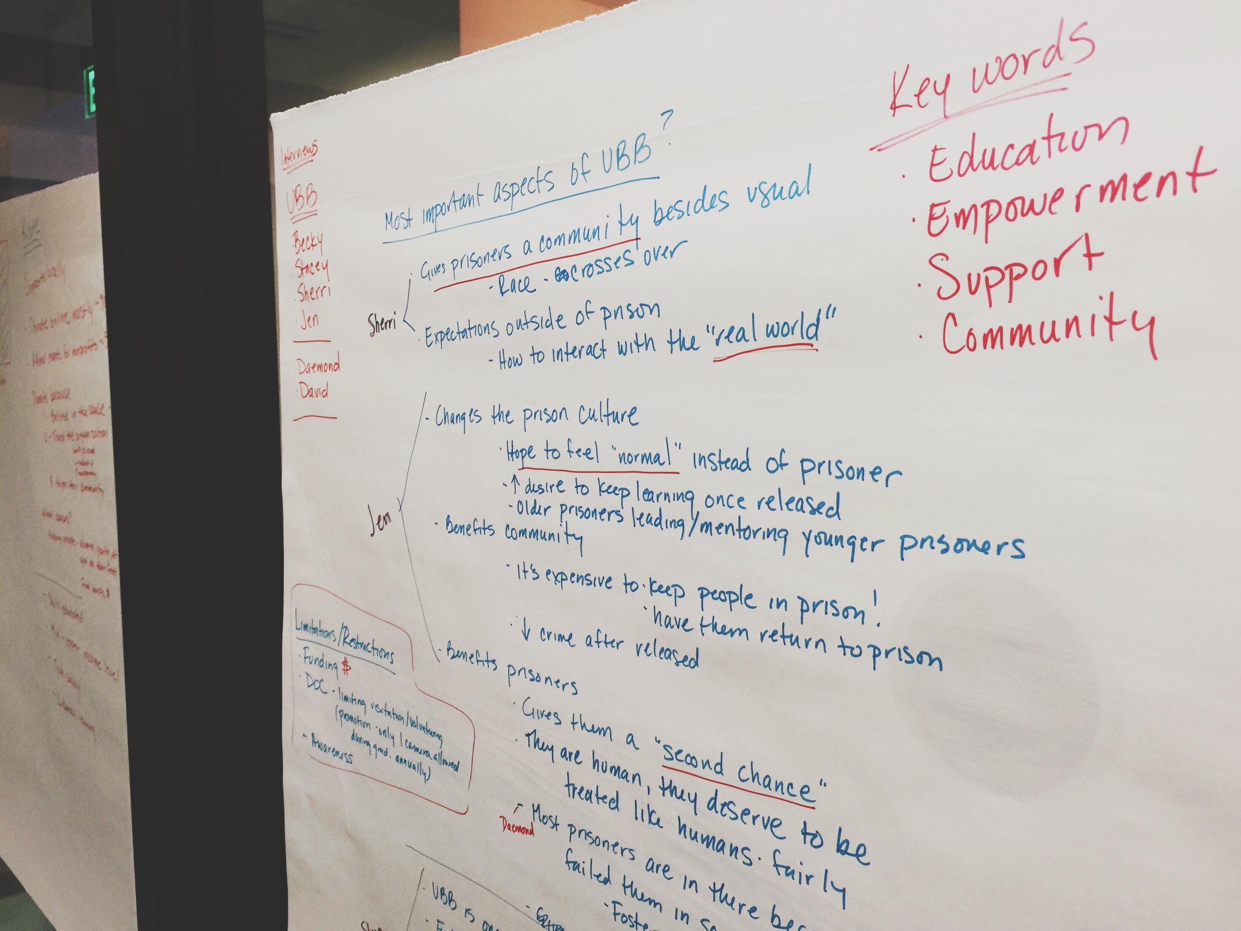
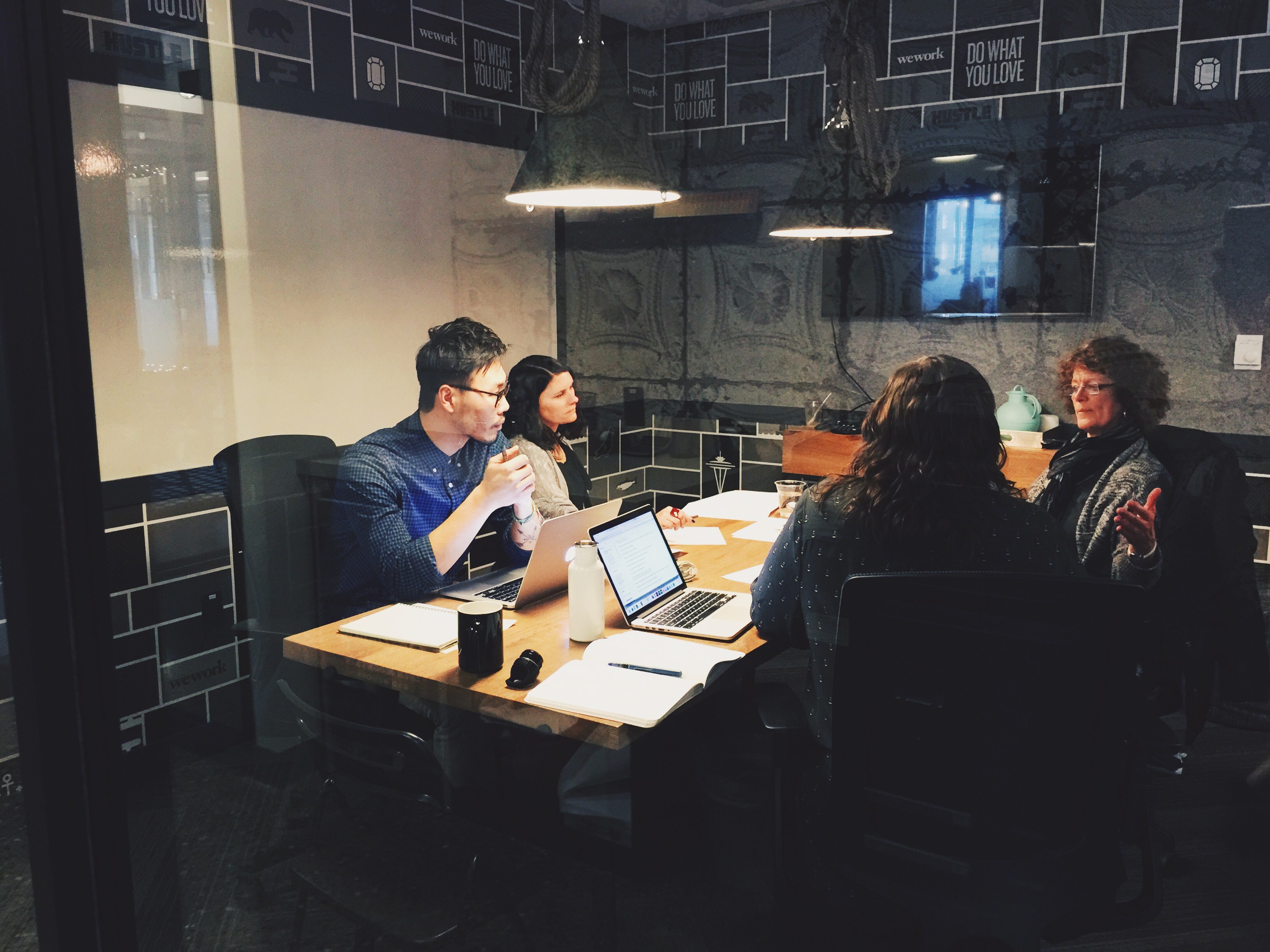
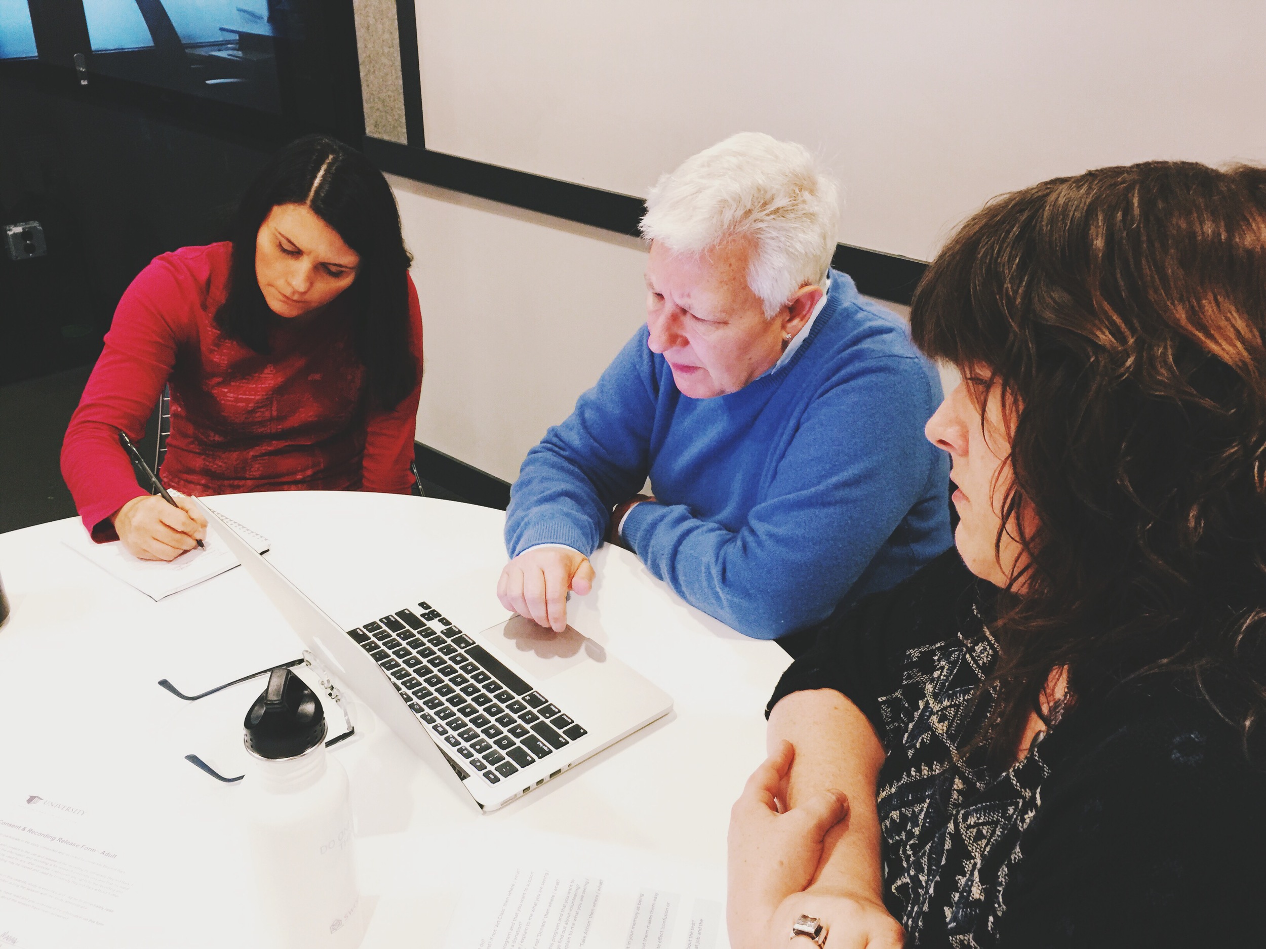
Stakeholder and User Interview
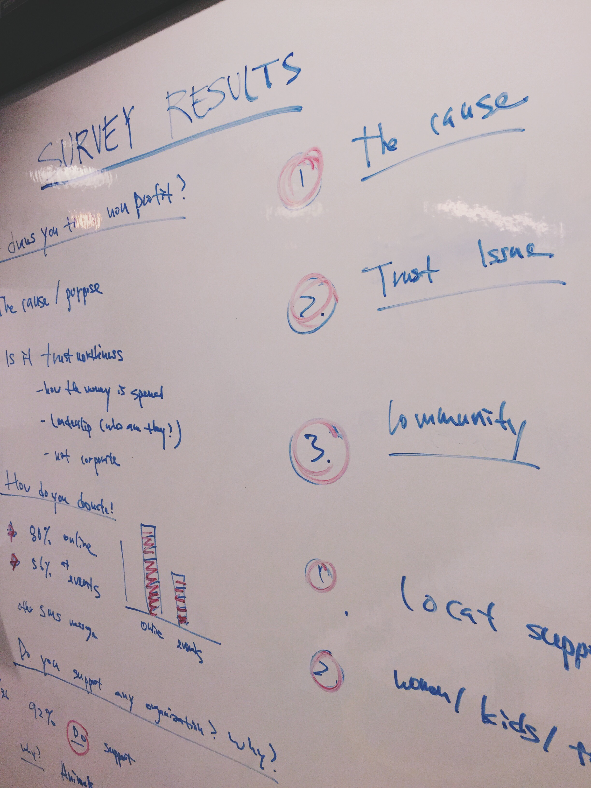
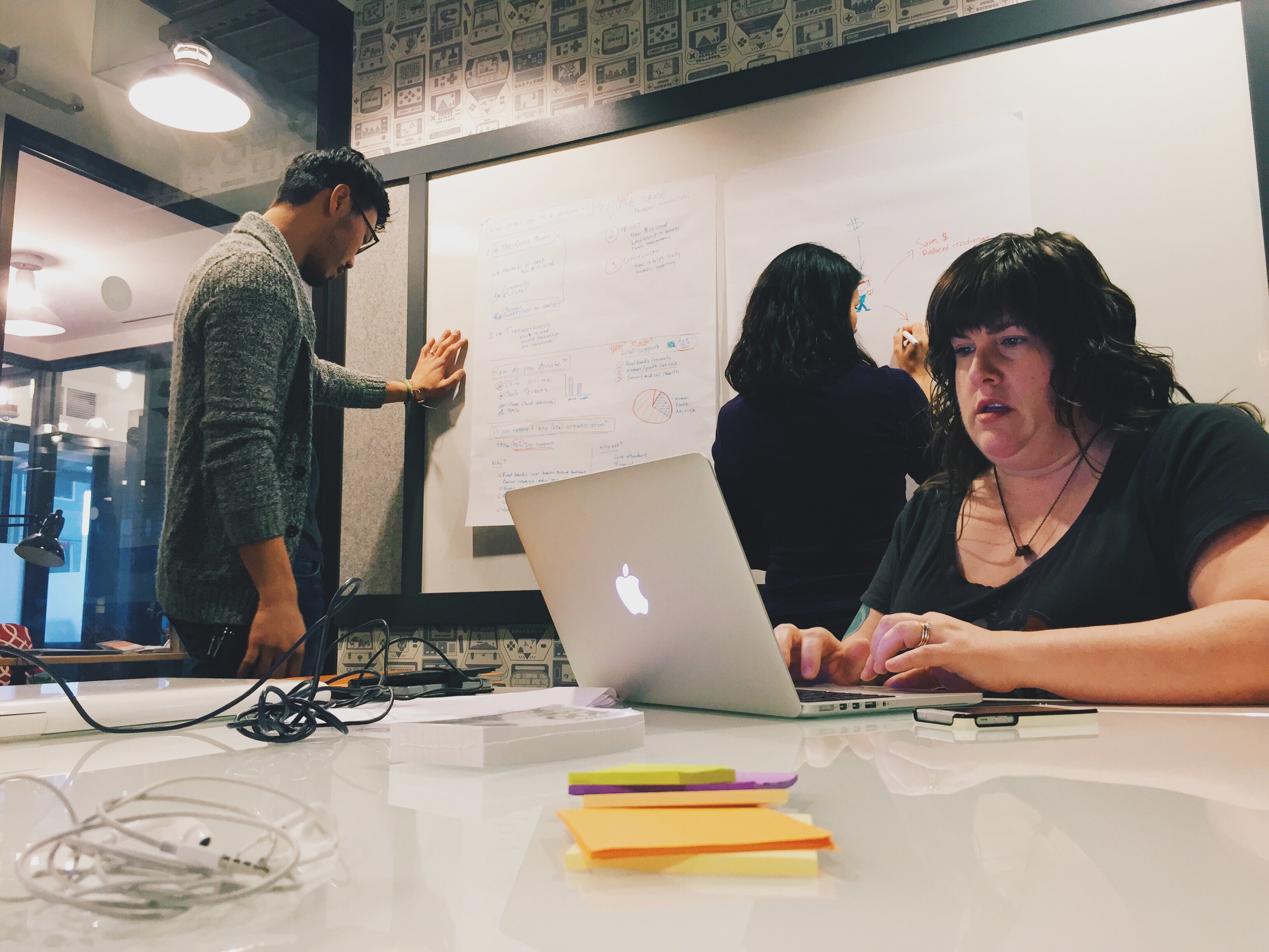
After completing three stakeholder and four user interviews, we realized that our conversations boiled down to three keywords: Education, Community; and Empowerment. We also did an online survey to discover more specifics about user donation habits. We had 36 participants. Based on survey results, we found that people support nonprofits because:
1. They believe in the cause and feel a personal or emotional connection to it.
2. They trust the organization.
3. Community, they want to help locally and to improve the community.
Heuristic Evaluation and Competitive Comparative Analysis
One of the first thing we did was to conduct a heuristic evaluation of the current site. Domain research is always crucial because you want to understand how the current site is organizing the content. We also conducted a competitive comparative analysis of agencies that were similar to University Beyond Bars. It was important for our team to get a sense of what other programs are out there.
Storyboard
A simple storyboard helped us visually understand what we are trying to do and keep us focus on our goals.
1. Attract volunteers and donations
2. Easy to use website
3. Student's profile
4. Clear action
5. Happy users
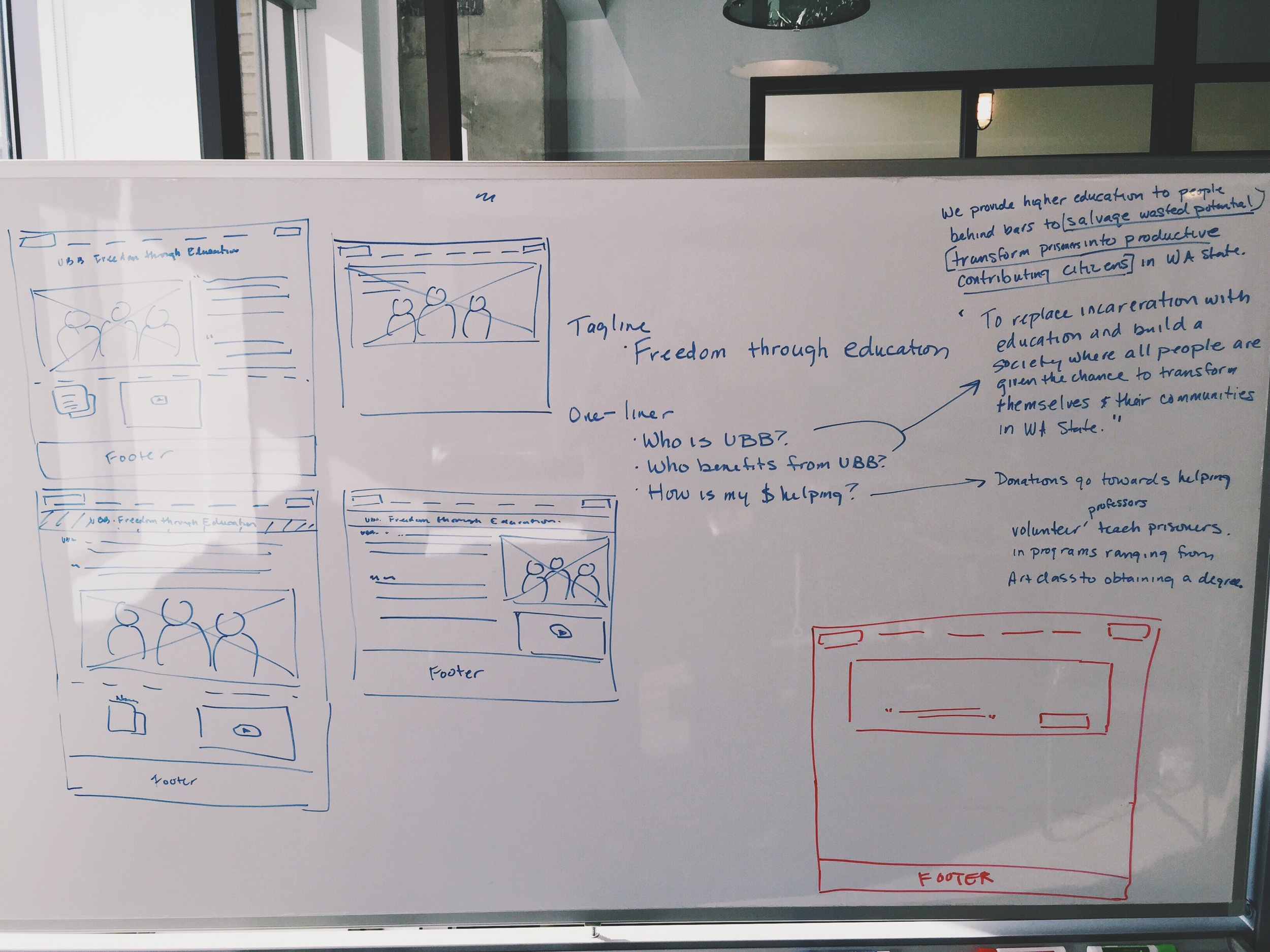
Concept Map
Through all the research, we determined UBB concept map.
Donations coming in.
Prisoner feels a sense of empowerment, being apart of a healthy community.
Improves prison environment, crossing racial boundaries.
Once a prisoner is out, the outside community is safer because of UBB's education program. They don't come out worst.
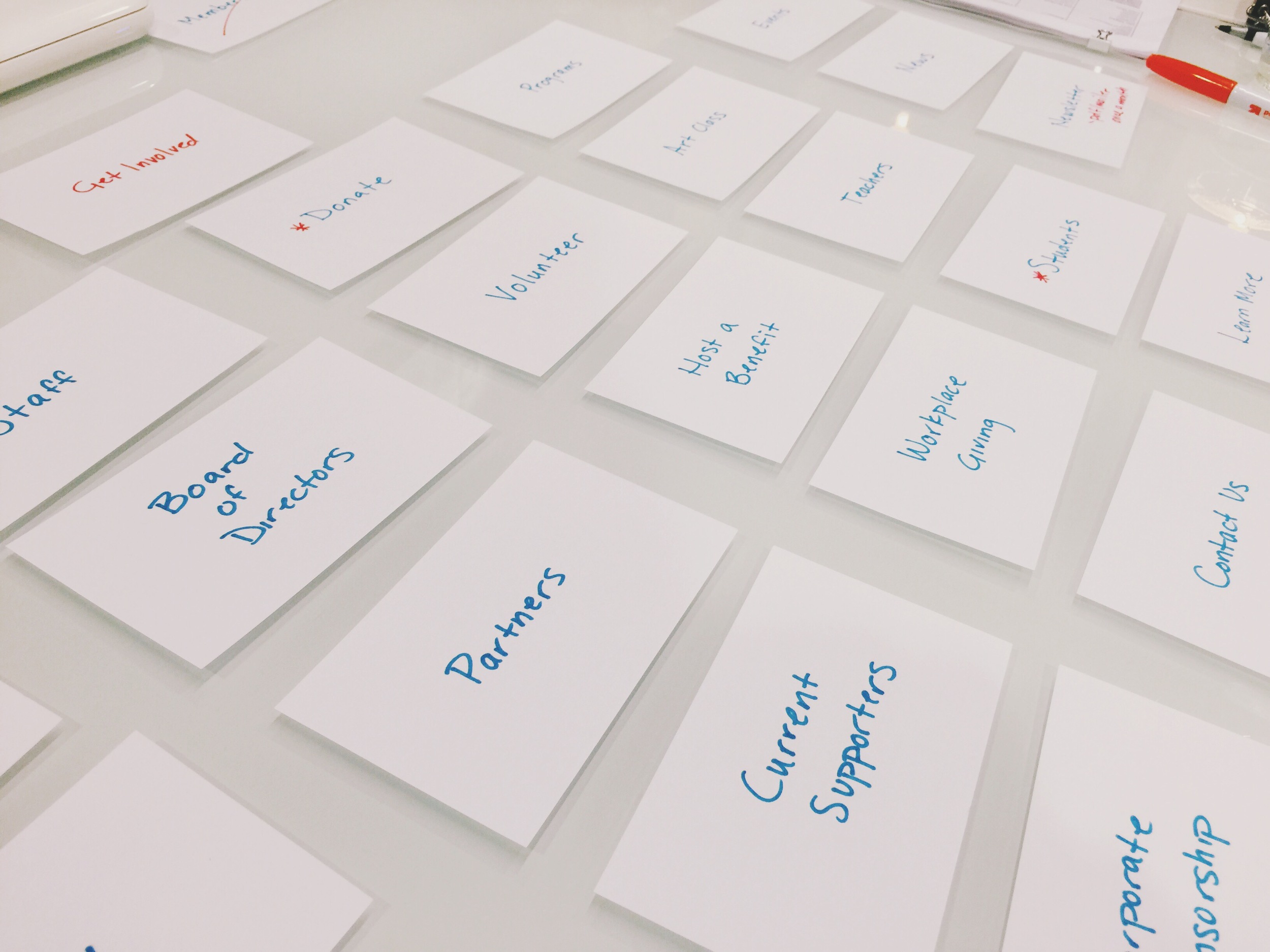
Identifying Information Architectures
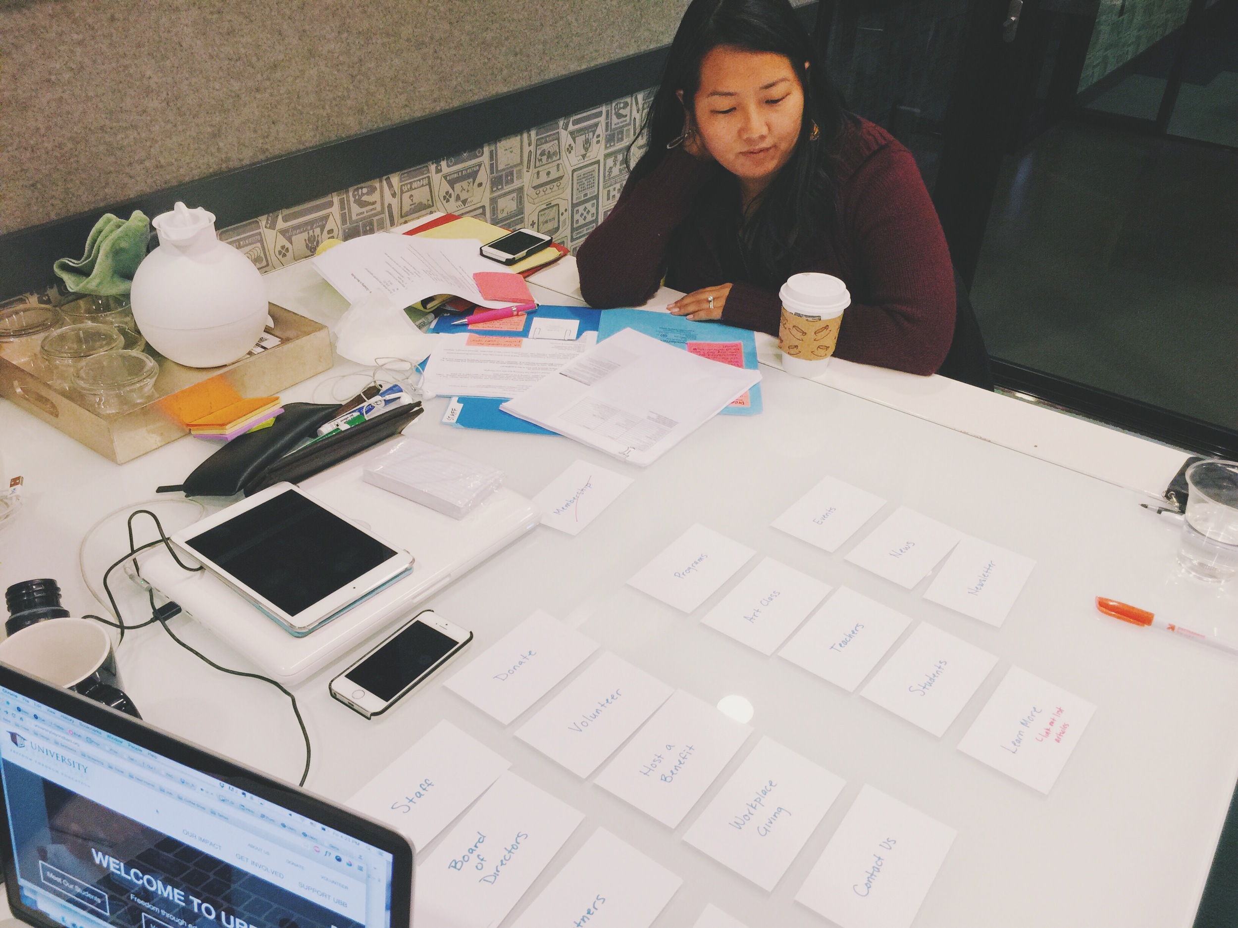
We did an online card sorting exercise with 16 users to begin the process of simplifying the information architecture of the UBB site. We did a physical card sort with the Executive Director of the organization as well. After results were collated, we began the process of creating the architecture for the new site. We liked the idea of using “The Challenge” and “The Solution” as two of the main categories for communicating why UBB exists and what it does to help its students.
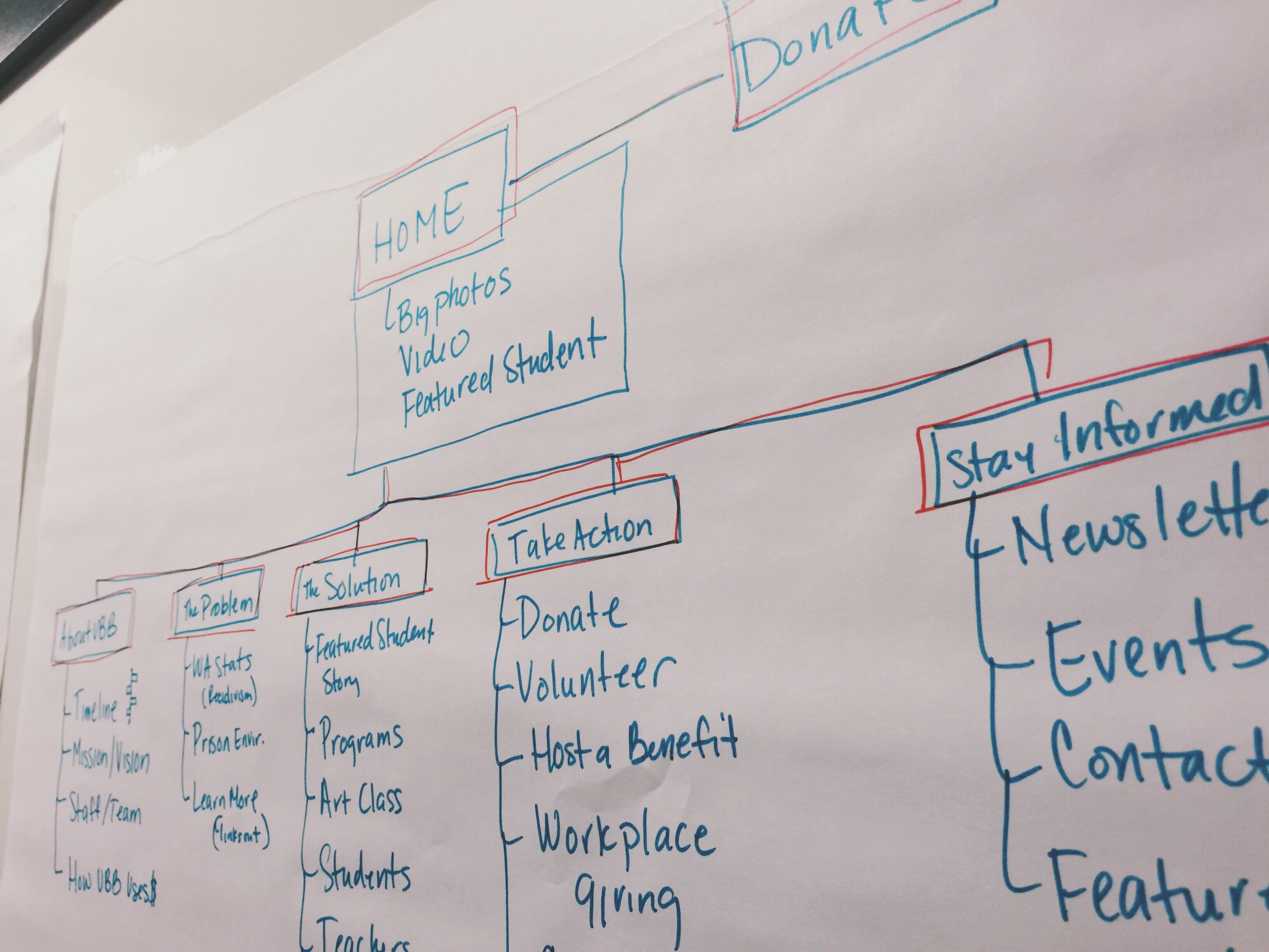
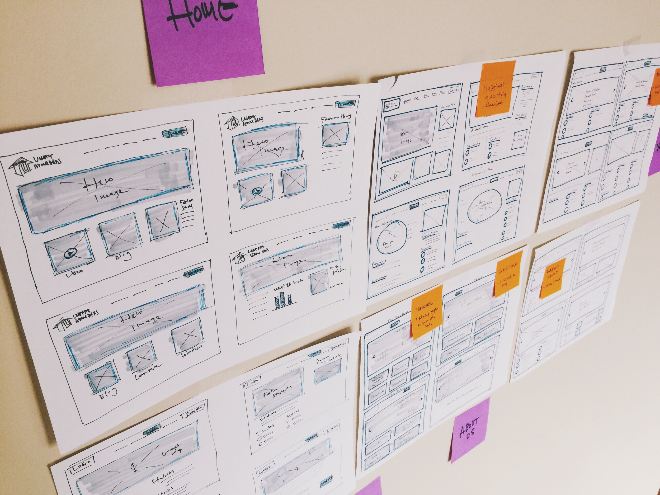
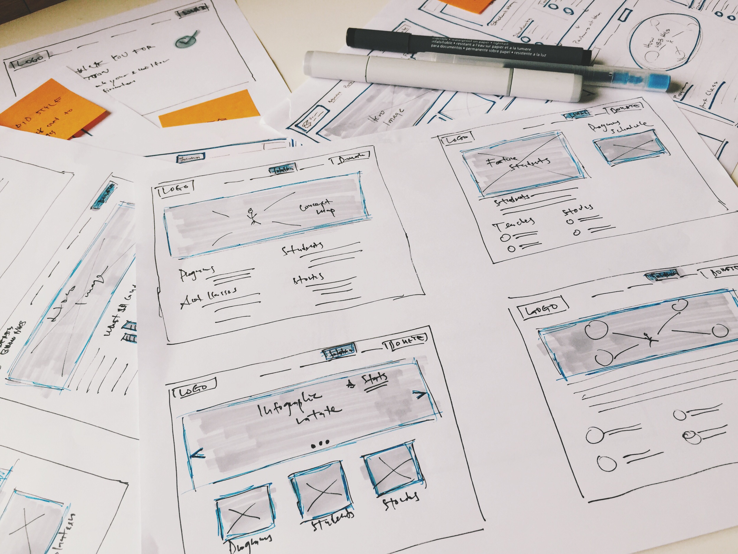
Wireframe
Our team spent quite a bit of time on wireframing. We had a design studio time where each of us would wireframe on our own and then came together as a team to discuss what we liked and disliked about each other's design. We took elements of what we liked about each of our designs and came up with a "final" wireframe to help us prepare to prototype.
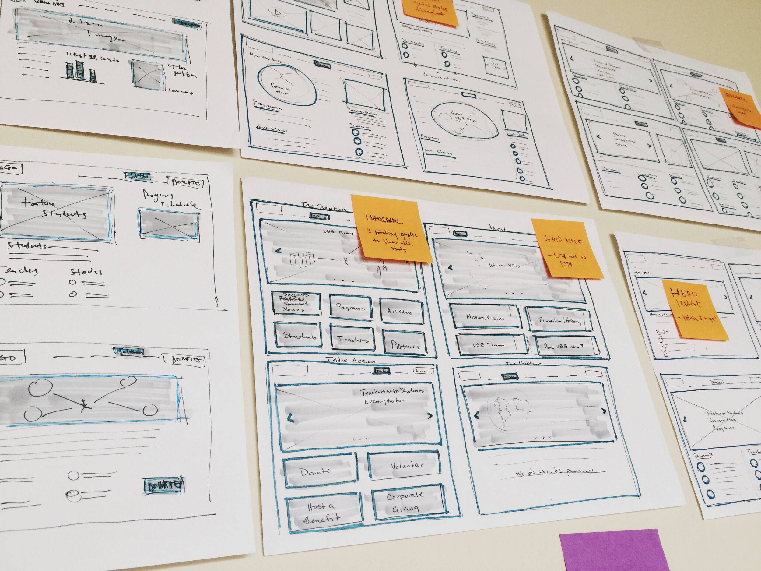
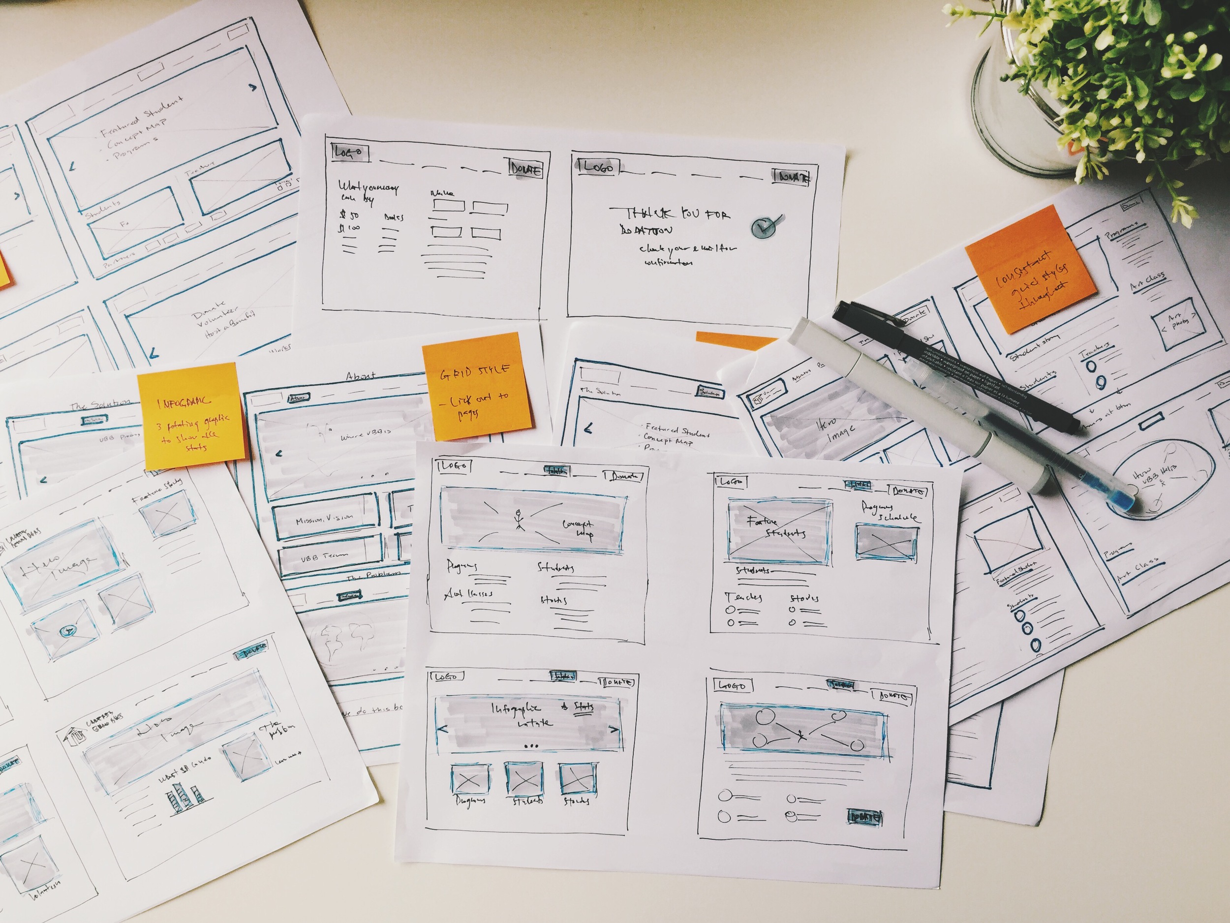
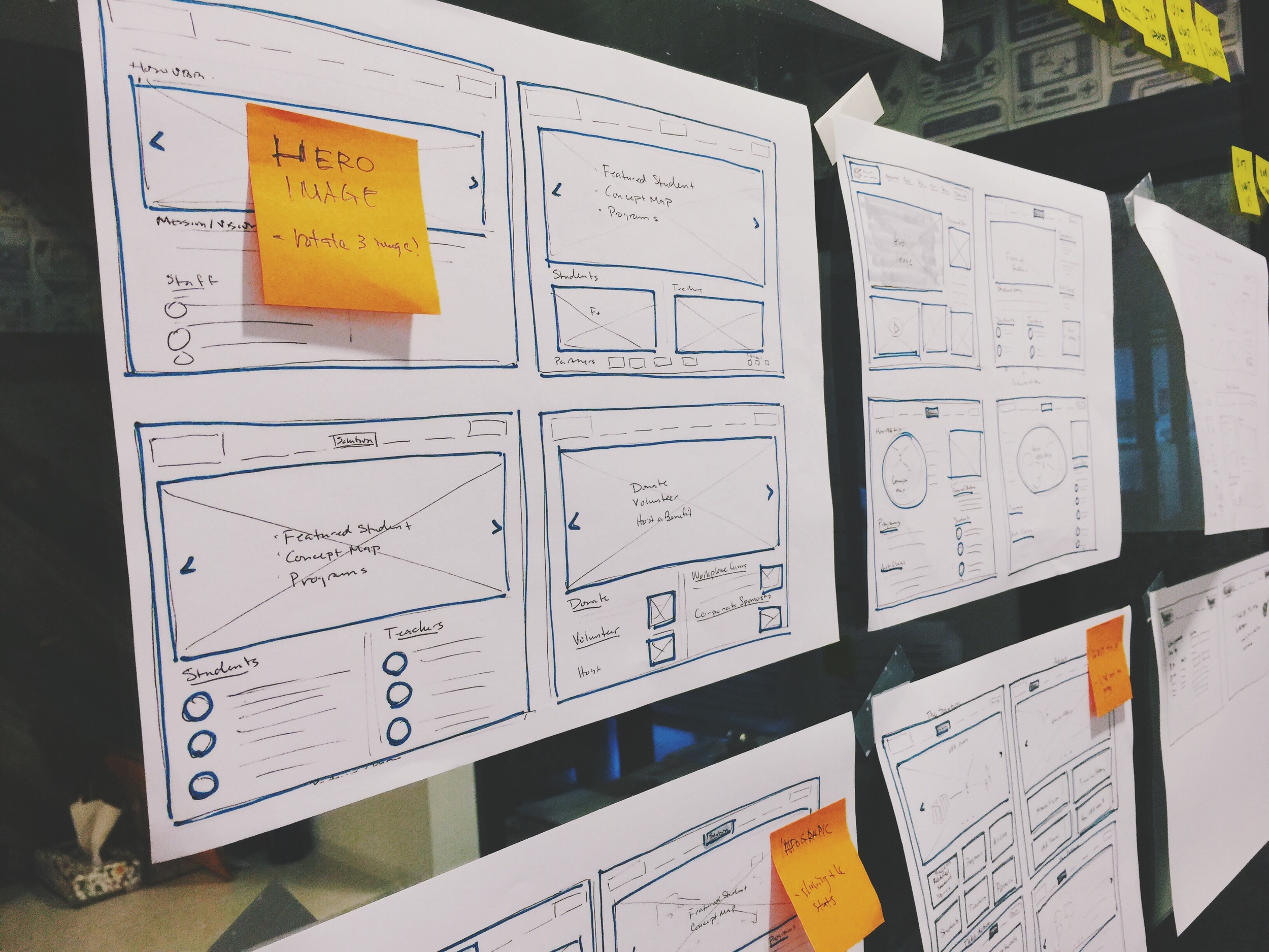
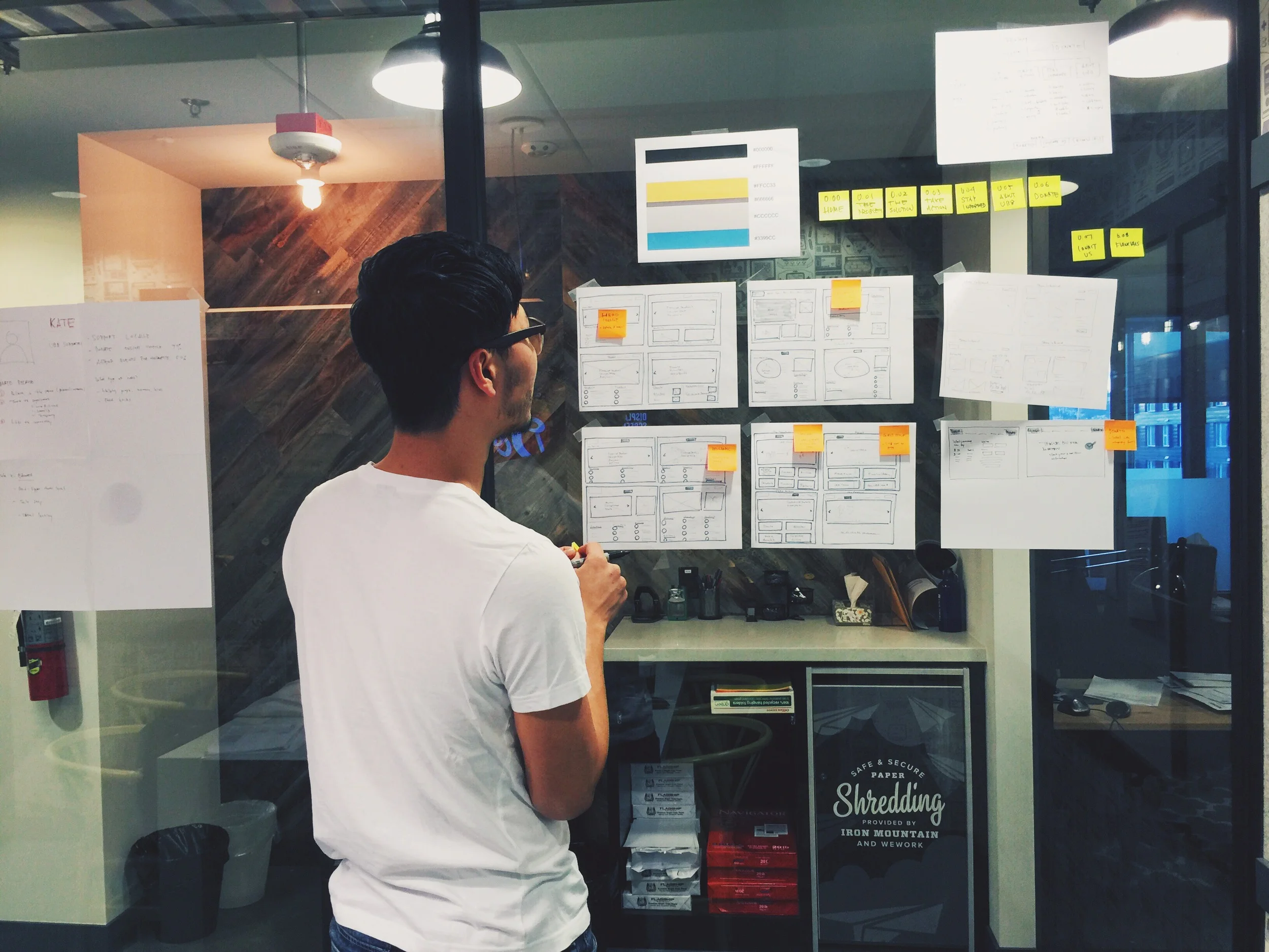

High Fidelity Design Comps
I designed some high fidelity design comps so that we can have a pretty good idea visually of what our final product should look like. It also helped us when we are prototyping in Squarespace to know what it should look like.
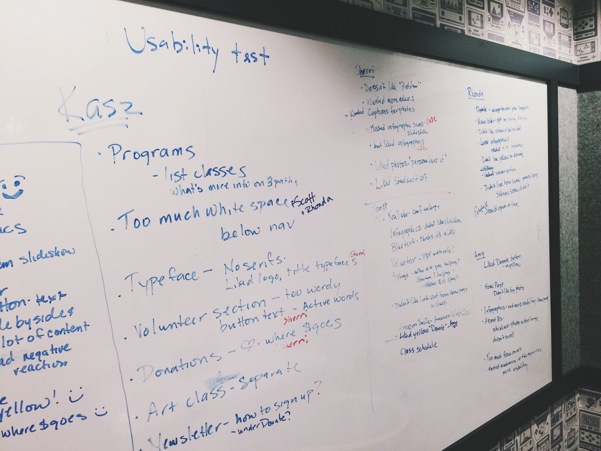
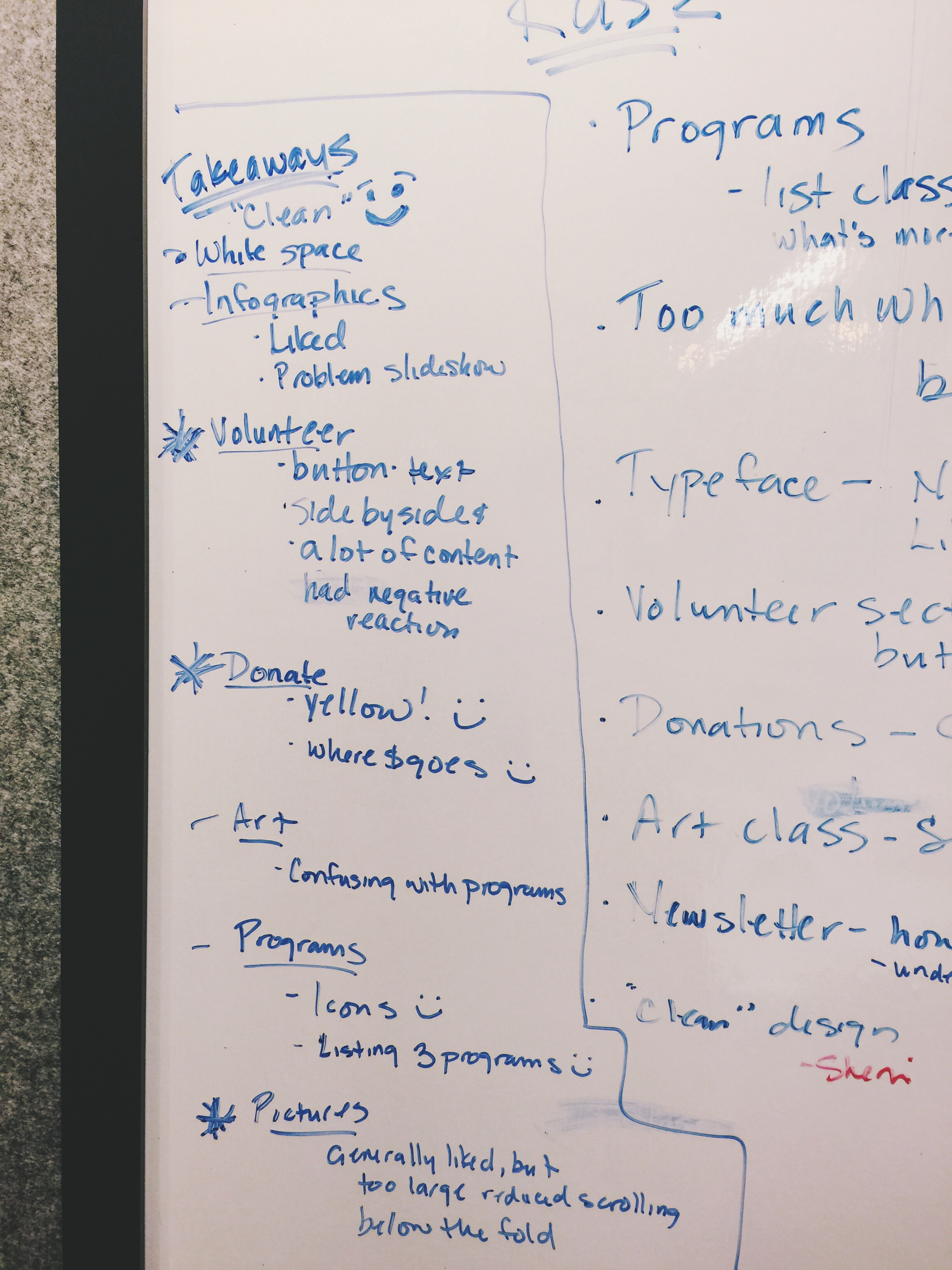
Usability Test
Usability test findings:
Participants all loved the clean design, however they thought there was too much white space at the top of the page between the navigation tabs and the hero image. Changes were made and our final design reflects that.
We need to make sure that users are led quickly to the The Challenge and The Solution.
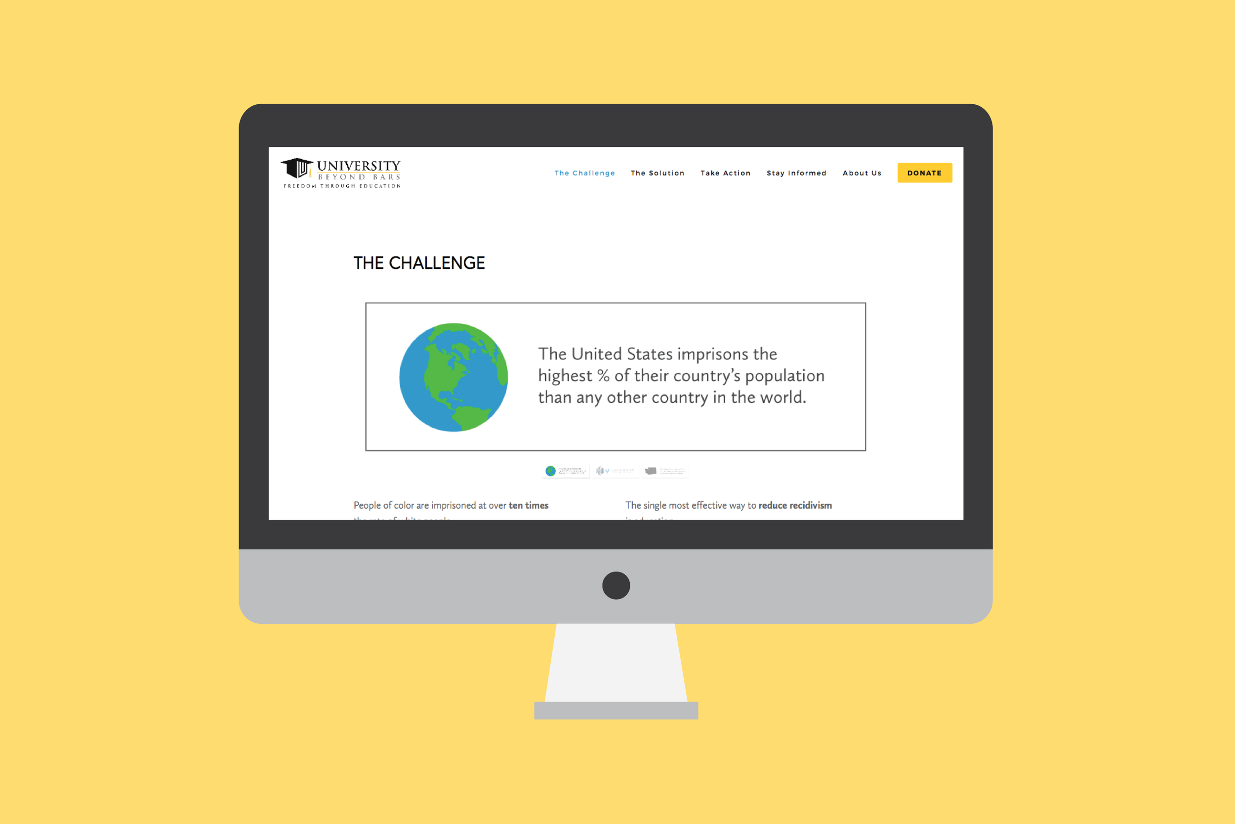
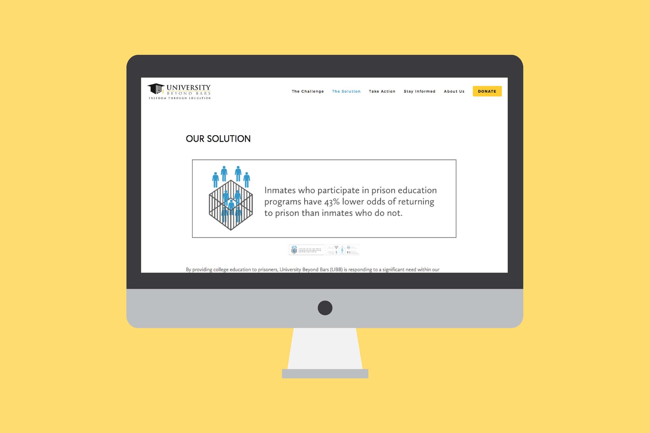
The infographic slideshows on the The Challenge and The Solution were too subtle and users missed the arrow controls. We changed the slideshow structure to make it more obvious, showing the thumbnails underneath so users can tell it is a rotating screen.
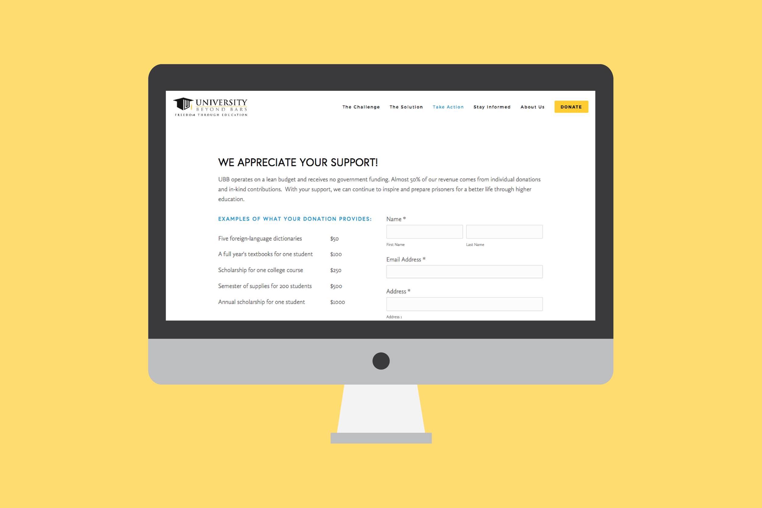
On the Donate page, users loved seeing what their money could do.
Users loved the navigation and were able to find information easily.
Presentation
Our team presented a case study with all of our findings in our research. Our clients was able to see the prototype. Here is what Becky Passarella, Development Director at University Beyond Bars had to say about my performance: "As a fortunate recipient of a team UX design, of which Esmond was a key component, Esmond has my highest regards - his work exceeded all of my expectations. From the beginning and throughout, he was attentive and listened well to our needs and specifications. Esmond provided excellent feedback by way of design strategies that integrated our needs with his ideas. He always seemed interested in our project, doing a good job for us, and it was more than obvious that his heart was in it. It was an absolute pleasure working with Esmond and we are so happy for the end product."